WCAG 2.0 was updated June 2018 to support 2.1 guidelines that have been in the works since 2016. Overall, WCAG 2.1 provides 17 new success criteria as guidance for mobile device users by supporting interactions using touch, handling more complex gestures, and avoiding unintended activation of an interface. This set of guidelines are meant to enhance mobile functionality to be friendlier and give end-users extreme flexibility.
NOTE: On the go? Get the WCAG 2.1 AA guidelines to take with you by downloading C2’s Web Accessibility Checklists for Code, Content, and Usability.
How are these guidelines categorized?
WCAG 2.1 guidelines are categorized into three different conformance levels (Level A, Level AA, and Level AAA) based on the impact they have on design or visual presentation of the pages in order to meet the needs of different individuals and different situations. Conformance levels must be met in full and conformance at higher levels indicates conformance at lower levels:
- Level A – The lowest and easiest level of conformance to obtain. Level A sets a minimum level of accessibility and does not achieve broad accessibility for many situations.
- Level AA – The mid-range and most common level of conformance to obtain. Level AA is the recommended conformance for all web-based information.
- Level AAA – The highest and hardest level of conformance to obtain. It’s not recommended to strive for full AAA compliance as it is not possible to satisfy all Level AAA Success Criteria for some content.
Who do these guidelines support?
- Low vision users – WCAG 2.1 extends contrast ratio requirements for graphics and introduces new guidelines for text and layout customization for web content and controls to support better visual perception.
- Users with cognitive, language, or learning disabilities – WCAG 2.1 includes requirements to provide additional information about the specific purpose of input controls and additional requirements to support timeouts due to inactivity.
- All users – realistically, WCAG 2.1 guidelines are all best practices to enhance usability and accessibility for all users of mobile devices.
How are these guidelines organized?
WCAG sorts their guidelines into the following categories: perceivable, operable, understandable, and robust.
- Perceivable: All users must be able to perceive your content. If there is audio or video content, you should provide text alternatives. If there is text content, you should provide audio alternatives or a way that assistive technology such as screen readers can consume it for the end-user.
Ask yourself: Is there anything on my site that a deaf, colorblind, low vision or blind user would not be able to perceive?
- Operable: All users must be able to operate your site. Most users with disabilities use a keyboard to surf the web using character key shortcuts along the way to navigate, interact with, and access content. Your site should be forgiving to your users if they make a mistake, offering ways to retract, correct, and confirm information.
Ask yourself: Can my site be navigated and operated solely through a keyboard? Do users have control of interactive elements on my site? Are tasks on my site able to be easily and successfully completed?
- Understandable: Just because your users can perceive and operate your site doesn’t necessarily mean that they can understand it. Interactive elements on a site including menus, icons, and links should all give an insight to their destination.
Ask yourself: Are all my site’s interactions easy to understand? Is the content on my site presented clearly and meaningfully?
- Robust: Users should be able to access your site from any device, platform, or browser. Adopt best development practices to support different operating systems and browsers. To guarantee a functional site for a diverse set of audiences, avoid any mishaps and ensure that your code is clean.
Ask yourself: Is our site developed with best practices in mind? Can our site or application support a variety of devices and browsers? Is the code to our site clean?
WCAG 2.1. Perceivable – Updates
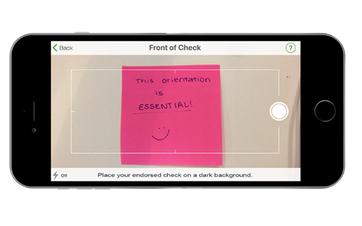
1.3.4 Orientation (AA): The intent of WCAG standard 1.3.4 is to ensure that content can be displayed in the preferred orientation – portrait or landscape – of the user unless presentation is essential to functionality. This is important for users who mount their devices to a fixed orientation (ex: such as the arm of a wheelchair) or have trouble rotating their device due to limited motor skills. Most devices have the capability to adjust their display orientation based on sensory information.
1.3.5 Identify Input Purpose (AA): The intent of WCAG standard 1.3.5 is to help users better understand form inputs by attaching metadata for additional information. Provide an attribute to autocomplete common inputs such as name and email address. Autocomplete works as a combination of browser functionality from information the browser has saved from previous inputs and your form fields ability to allow autocomplete.
Tip: Defaults for autocomplete on form fields are commonly already in place, but it doesn’t always connect the right data to the correct field. Fully utilize the autocomplete feature by specifying the type of field.
See code example below to understand specifying types of fields for autocomplete features:
<p> CODE: https://gist.github.com/thec2group-blog/5501cd0f91c0c8c1c964f08ae4e4f180.js</p>
1.3.6 Identify Purpose (AAA): The intent of WCAG standard 1.3.6 is to support users who need extra support by optimizing familiarity. Be specific when you write descriptive text for icons and links, and use ARIA landmarks to identify different regions of a page. Screen readers will be able to easily interpret the layout and structure of the site.
Note: There’s no set universal terminology for icons, so it’s not the most practical or realistic to mark-up icons and links for users to manipulate with their own set of icons and terms.
See code snippet below to understand where content goes in terms of landmark region:
<p> CODE: https://gist.github.com/thec2group-blog/4782aa96e7ab16bc1760d231fa950599.js</p>
1.4.10 Reflow (AA): The intent of WCAG standard 1.4.10 is to support low vision users by enabling easier readability and tracking through responsive design. When your site is at 400% zoom, content should automatically present itself in one column so scrolling in more than one direction is unnecessary. Ensure that you’ve tested what this looks like on screens as small as 320px wide for a common mobile device screen size.

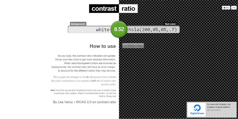
1.4.11 Non-text Contrast (AA): The intent of WCAG standard 1.4.11 is to support low vision users who many not see a full range of colors. Check for these vision issues with a contrast ratio tool such as Lea Verou’s Contrast Ratio Checker. This tool tests whether a combination of colors pass WCAG 2.0 standards with a ratio at least 3:1 against adjacent colors to interface components such as links, buttons, and other controls along with meaningful graphics such as charts.
Reminder: this guideline is for non-text content. Do not get this confused with WCAG standard 1.4.3 which pertains to text.
1.4.12 Text Spacing (AA): The intent of WCAG standard 1.4.12 is to ensure low vision or dyslexic users can override set text spacing to enable easier readability for increased individual reading speed. To configure this, use relative units (ex: em, percentage) to specify letter-spacing, line-spacing, and the size of text containers.
Note: You cannot have any inline styles or set percentage heights for any content areas. You’re welcome to change the width percentage.
See code example below using em as a way to set letter spacing in a header:
<p> CODE: https://gist.github.com/thec2group-blog/86c1e06105e754885a936002d6a77518.js</p>
1.4.13 Content on Hover or Focus (AA): The intent of WCAG standard 1.4.13 is to provide a way for assistive technology users to correctly perceive additional information such as tooltips that appear and disappear with hover and keyboard focus.
Note: Tooltips should not disappear due to a timer or when you move your mouse away. You need to take an action to close them such as the ‘Escape’ key.
See code example below of configuring tooltips to close with the “Esc” button:
<p> CODE: https://gist.github.com/thec2group-blog/2651c32fc568ab3993a402ba70914bda.js</p>
WCAG 2.1 Operable – Updates
2.1.4 Character Key Shortcuts (A): The intent of WCAG standard 2.1.4 is to support speech input users using voice control as their means of navigating. When these users use voice control, common keywords and phrases may activate character key shortcuts on a site. Users must be able to turn keyboard shortcuts off, re-configure these to include non-printable character keys (such as Ctrl, Alt, Cmd), or the shortcut is only active when the component has focus.
Example: Users may ‘tab’ to focus on a component then use voice recognition to activate the key. Watch this YouTube video showing how a word or phrase can trigger several key shortcuts at once in Google Drive.
2.2.6 Timeouts (AAA): The intent of WCAG standard 2.2.6 is to support users with cognitive disabilities by alerting them of user inactivity that could result in a page timeout and data loss. Unless it’s practical to save the user data for at least 20 hours, the site must warn the users about the time duration until a timeout.
Example: A lengthy job application may offer the option to save your data in their database and then return to it later to complete. The browser captures information and knows when that user has returned.
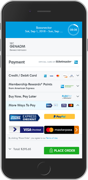
2.5.1 Pointer Gestures (A): The intent of WCAG standard 2.5.1 is to support users with limited motor skills who cannot perform complex gestures accurately. These multi-point or path-based gestures, such as pinch zooming and swiping, must be able to be overdriven by single-point activations such as taps, double taps, and long presses.

2.5.2 Pointer Cancellation (A): The intent of WCAG standard 2.5.2 is to support users of various disabilities who may trigger something accidentally. Allow users to cancel an accidental trigger by moving their finger or pointers from that function. At least one of the following should always be true:
- No down-event = The function does not activate on the down-event (down click).
- Abort or undo = The function is activated on the up-event (release click) but can be undone (ex: typing phone number into mobile and then backspace).
- Up reversal = drag and drop (event happens on a held click) and will reverse if there is an up event (release of click).
- Essential = The function is activated on the down event (down click) for an important reason.
Tip: it’s preferred to offer up reversal to users, so they can correct a mistake.
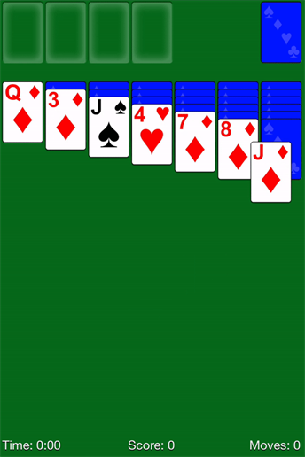
2.5.3 Label in Name (A): The intent of WCAG standard 2.5.3 is support users who rely on visual labels. Provide a better experience to your users by giving the visual and programmatic label the same names. The text shown on interface components like buttons must be able to be read by screen readers and triggered by voice commands for users who use speech recognition software. Use ARIA labels to get screen readers to register and read the label correctly.
An example of an ARIA label code is:
<p> CODE: https://gist.github.com/thec2group-blog/642266ffbd3508809cf1e287b5521b0e.js</p>
Tip: If you replace text with an icon, you can make a screen reader read the text to its users by using aria-label attributes.
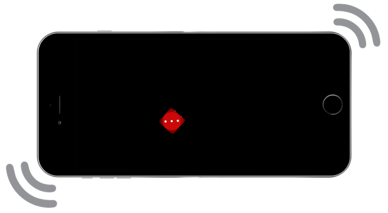
2.5.4 Motion Actuation (A): The intent of WCAG standard 2.5.4 is to support users who may be unable to perform certain motions and movements. Functions that are triggered by moving a device or gesturing towards a device can also be operated with buttons that replace the same function.
Note: This is commonly seen in video games or gaming applications for mobile devices.
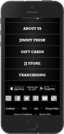
2.5.5 Target Size (AAA): The intent of WCAG standard 2.5.5 is to support a variety of users including those who have hand tremors, large fingers, low vision, and use mobile devices typically with one hand for touch input. To accommodate these users, create inbound target areas that are at least 44x44 CSS pixels.
Reminder: Targets may be smaller if the link is located within a block of text or the size is determined by the device.
2.5.6 Concurrent Input Mechanisms (AAA): The intent of WCAG standard 2.5.6 is to support users with limited motor skills who prefer to use and switch between using certain assistive technology and input mechanisms even when it’s unusual (ex: using a mouse and keyboard for a tablet).
Note: Do not limit touch-screen devices to only touch interactions. It’s pointless to detect, for example, touchscreen attributes if it should be commendable for all input mechanisms.
See example below to see one variation of accommodating multiple input mechanisms:
<p> CODE: https://gist.github.com/thec2group-blog/c0a151d9700d602e5527b6ad98ce5d76.js</p>
WCAG 2.1 Robust – Updates
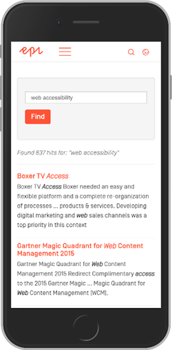
4.1.3 Status Messages (AA): The intent of WCAG standard 4.1.3 is to support blind or low vision users who may use screen readers to navigate without giving automatically updated content visual focus. For example, if you’re searching something on a site, the update “53 results found” would be read to the user.
Tip: Ensure that you define the ARIA role (status, alert) within your HTML. It’s technically the developer’s responsibility to decide how important the information is to present to the user.
Wrapping up
I hope you found these WCAG 2.1 guideline explanations to be helpful as you work towards implementing best practices for enhanced accessibility. Remember, WCAG is a set of standards meant to enhance user experiences and support individuals of all abilities and disabilities.
